
Transforming complex data into actionable insights
Target Users:
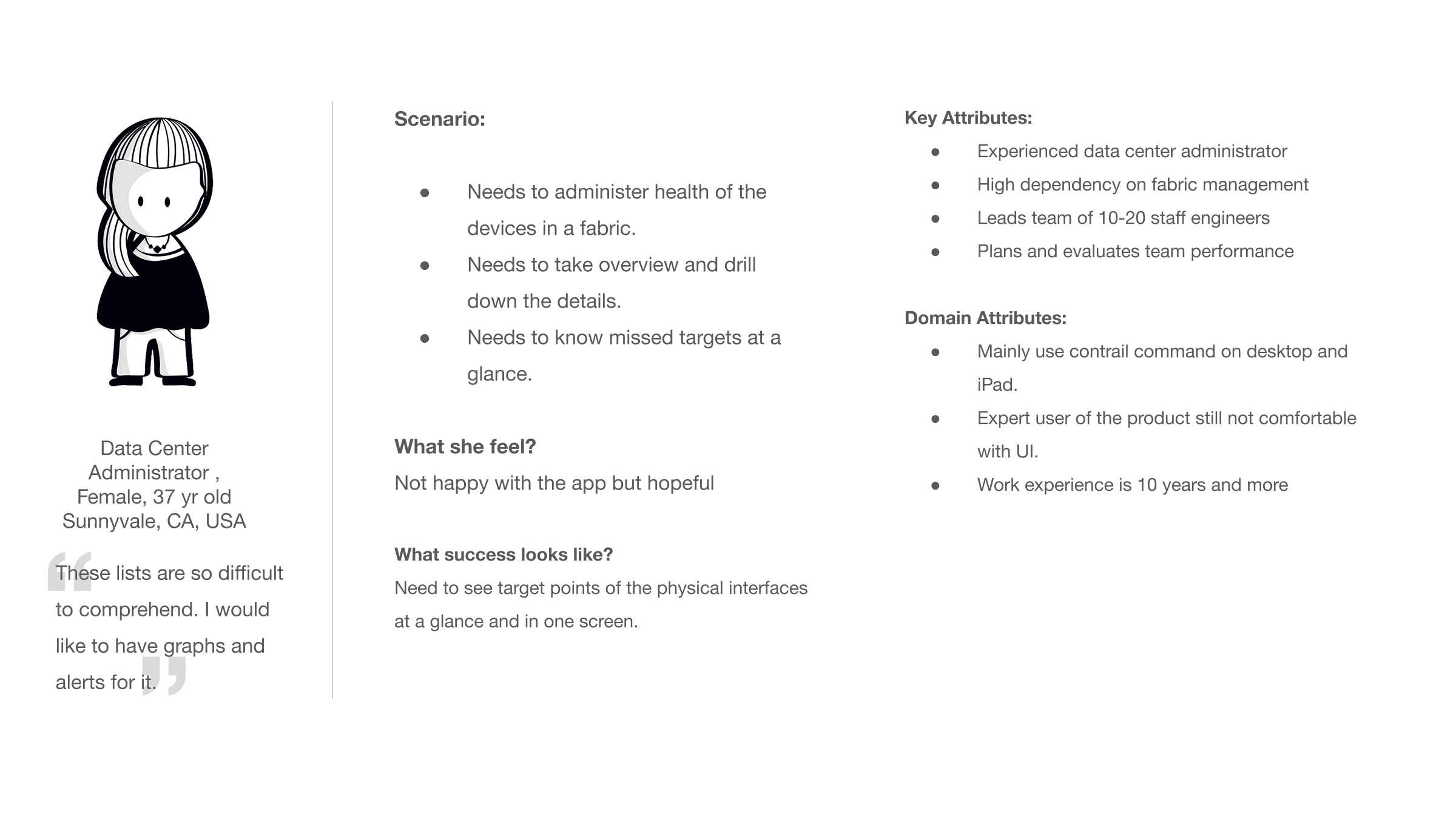
Experienced data center administrators using contrail command to monitor and manage large scale fabric networks.
My Team:
1 product manager
4 developers
1 UX researcher
1 UX designer intern (me)
My Role:
UX design intern
Focus Area
Data Visualization
Interaction design
Usability Testing
Background:
Contrail command is Juniper's B2B web application for data center and cloud fabric management. The business goal was to gain competative advantage over Cisco DCNM and Arista by improving usability, reducing information overload, and enhancing operational efficiency for expert administrators.
Impact:
Reduced task completion time by 17.83%, Reduced errors by 28.64% and $289K annual savings
Problem Statement
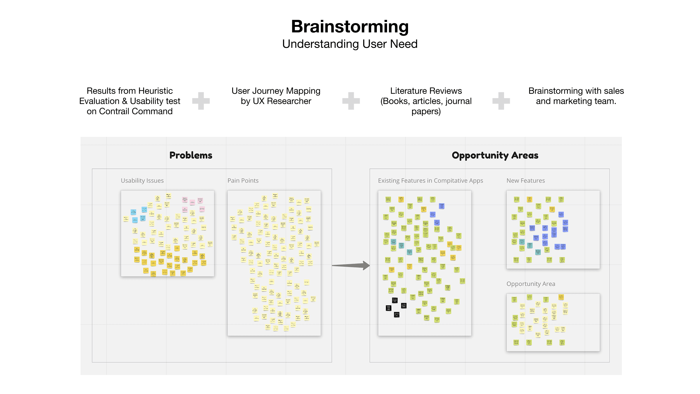
Heuristic evaluation and user interviews revealed several critical pain points:
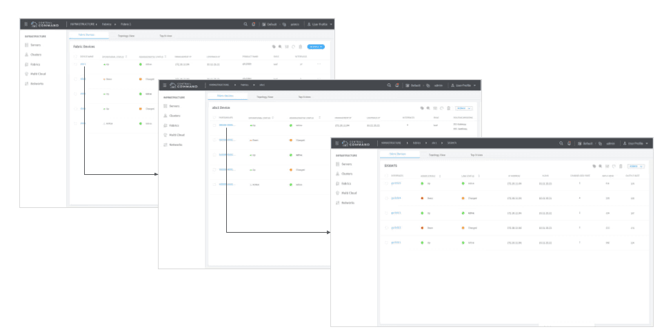
Device health was presented in a list format, making quick assessment difficult.
Users couldn't monitor interface KPIs at a glance
High information density with low clarity delayed critical decisions
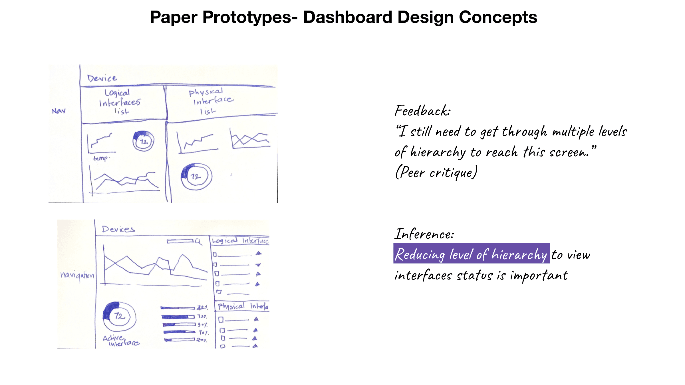
Key performance indicators were buried within multiple navigation levels.
" These lists are so difficult to comprehend. I'd like to have graphs and alerts instead."
-Data center administrator
User Persona
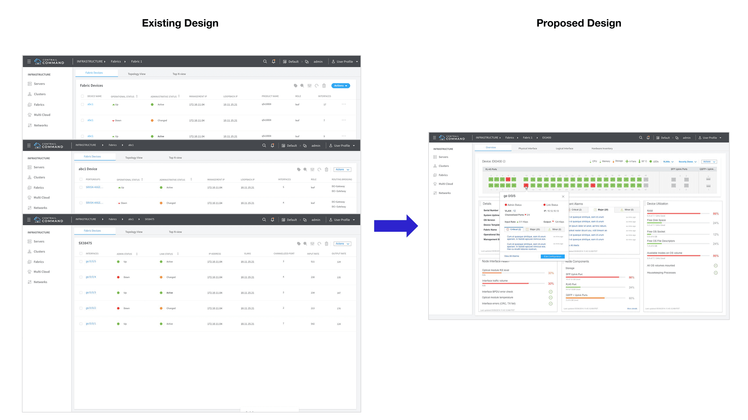
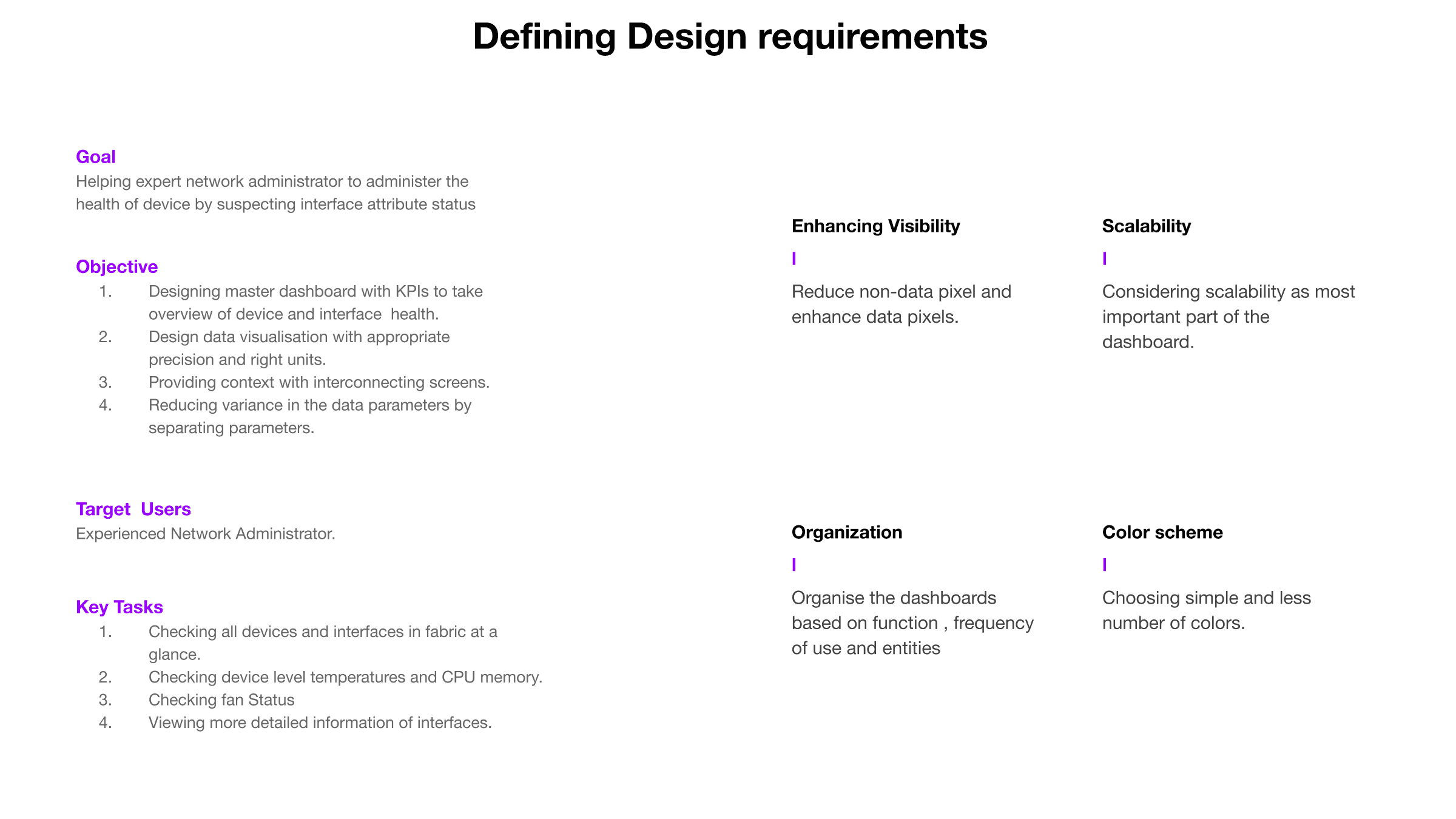
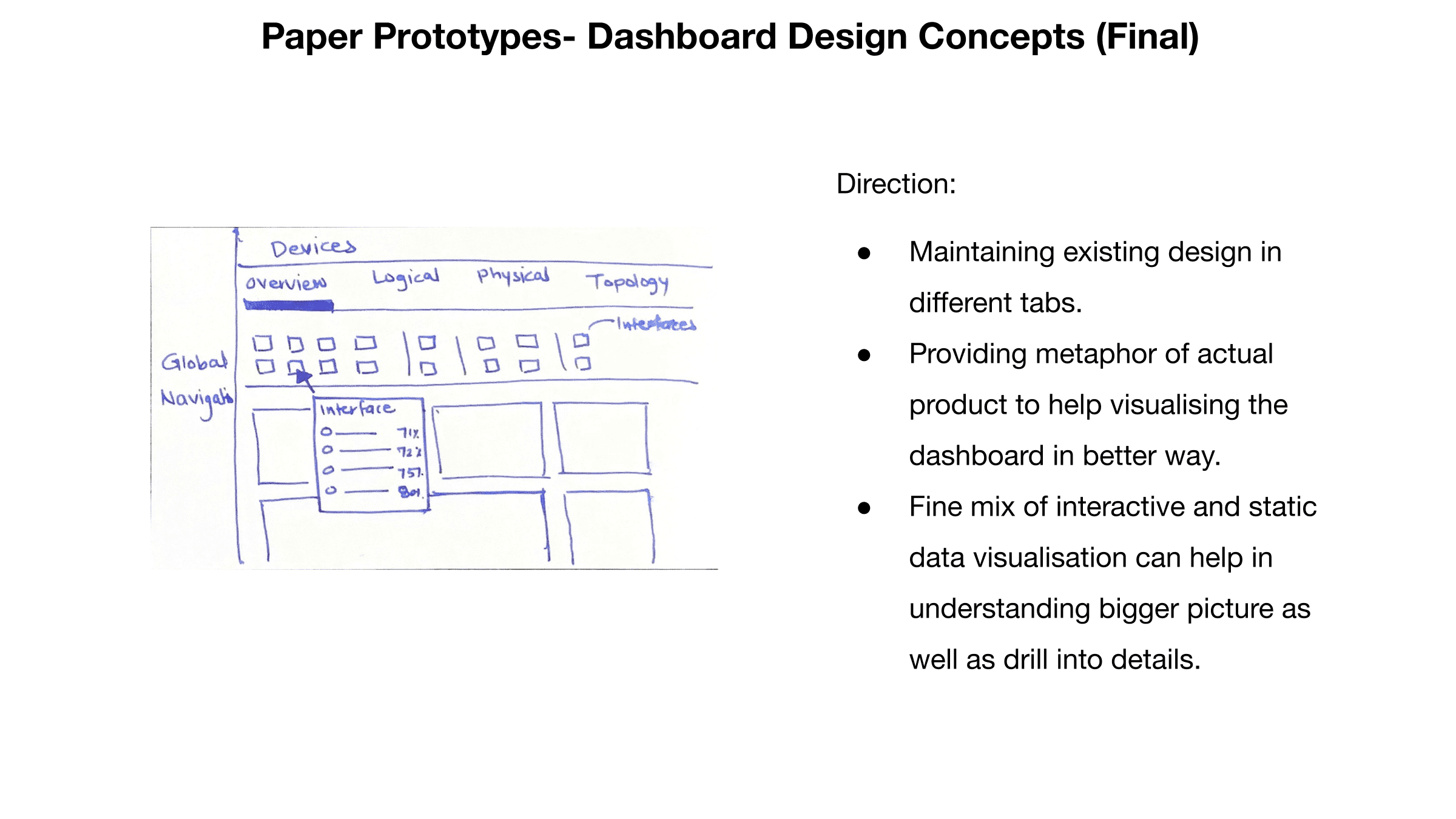
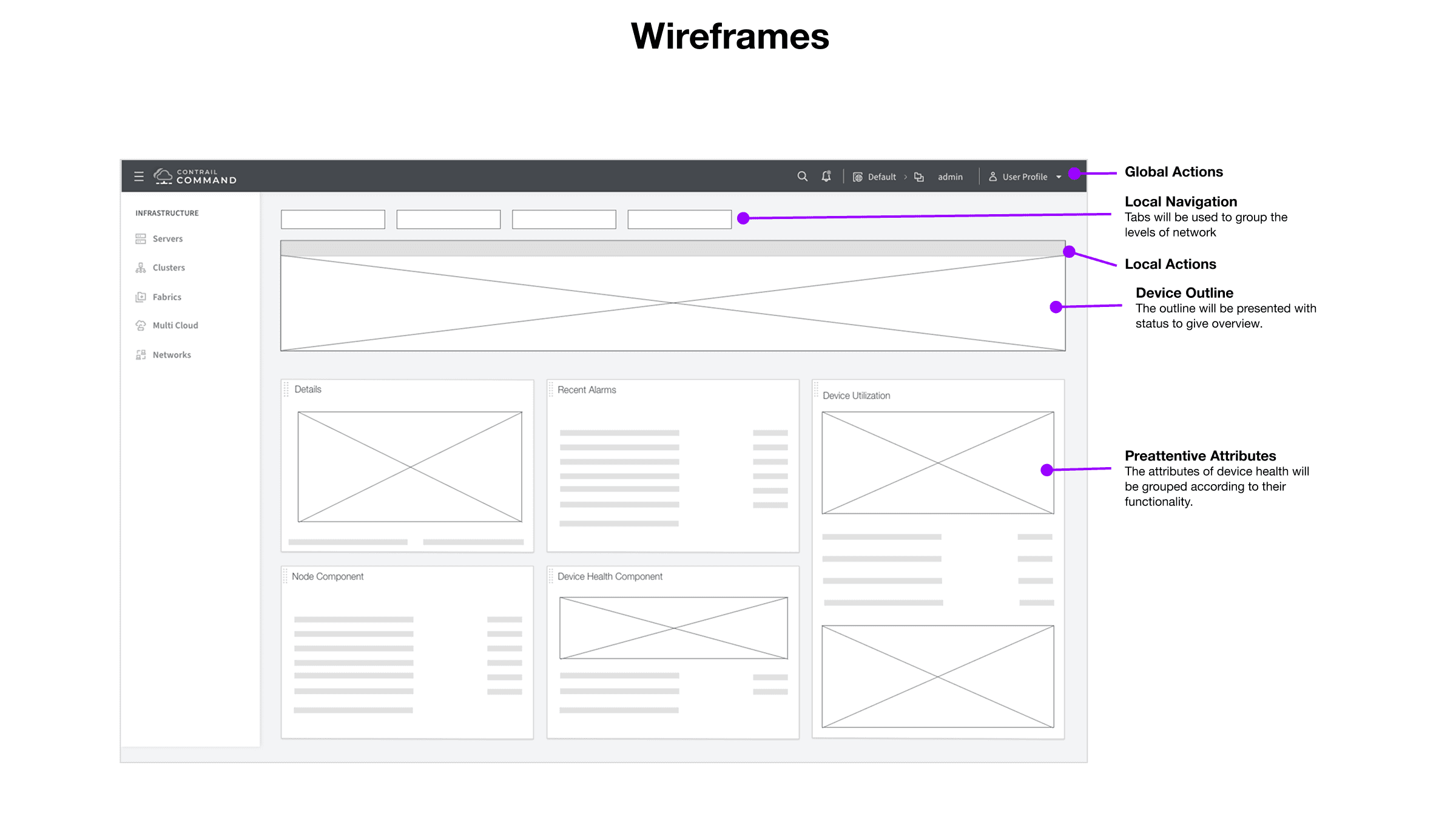
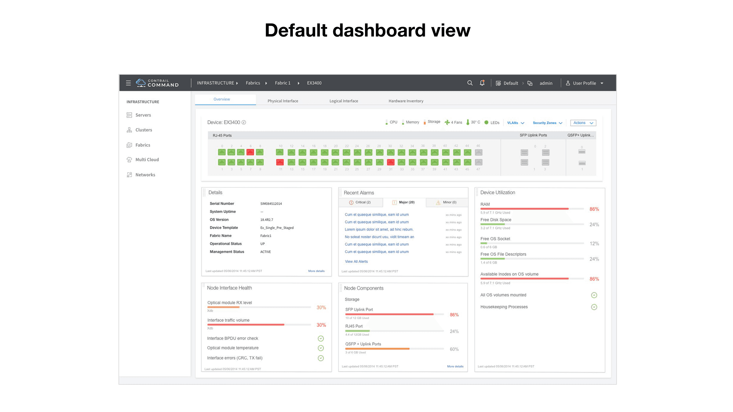
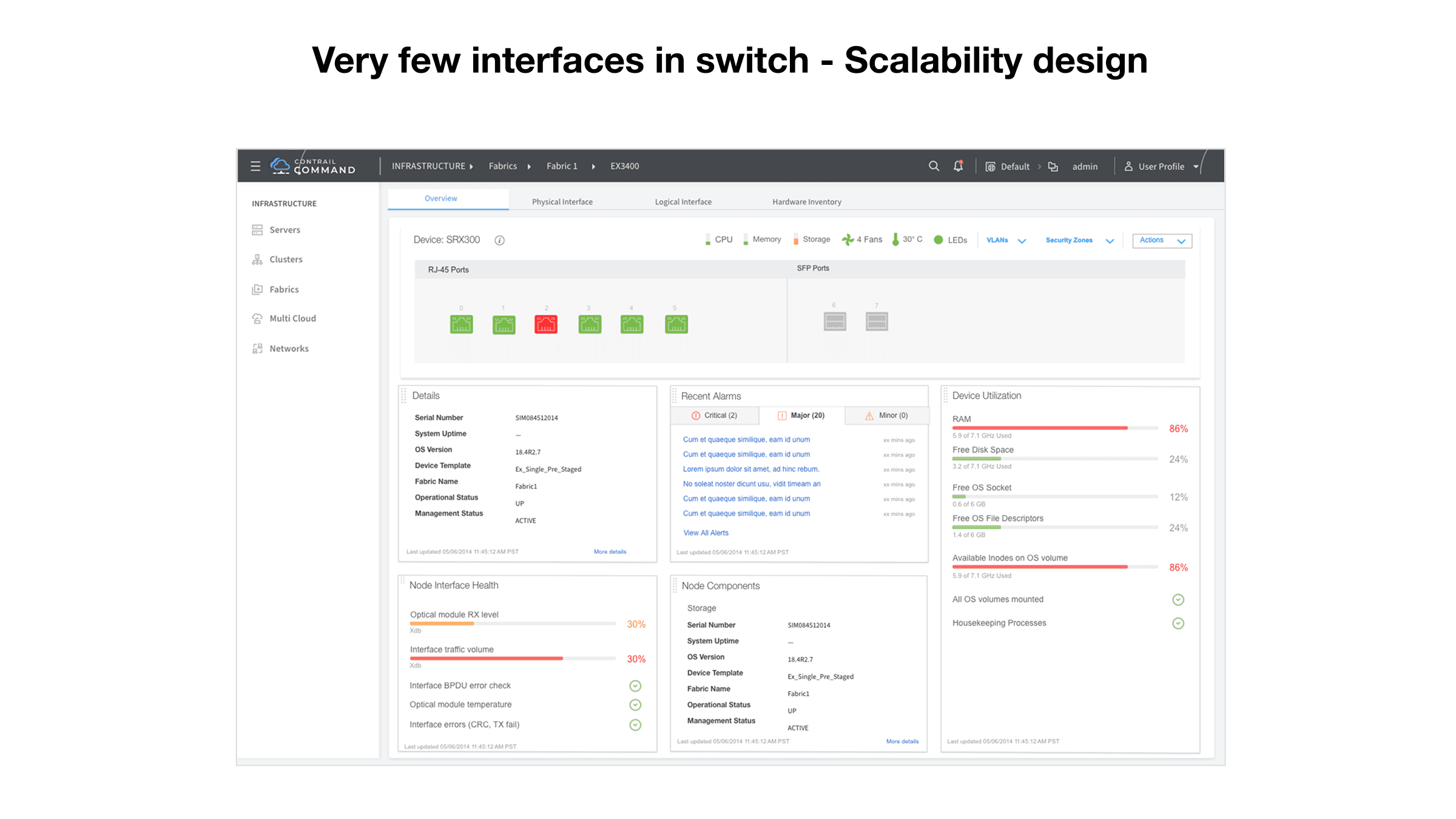
Solution
Designed scalable, visually rich Device health dashboard to help administrators:
View real-time device and interface status at a glance.
Drill down into details without losing context.
Improve decision making with visual KPIs and pre-attentive cues.
Recognition
This project was selected for CTO presentation at Juniper Networks out of 63 projects
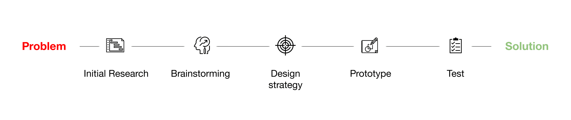
Design Process


Challenges
Understanding Complex Network KPIs
Translating technical metrics like port latency, CPU memory usage, and fan status into visual language was initially overwhelming. As a UX designer without a networking background, I had to immerse myself in domain-specific literature and stakeholder conversations to truly grasp what mattered most to users.Designing for Scalability Across Devices
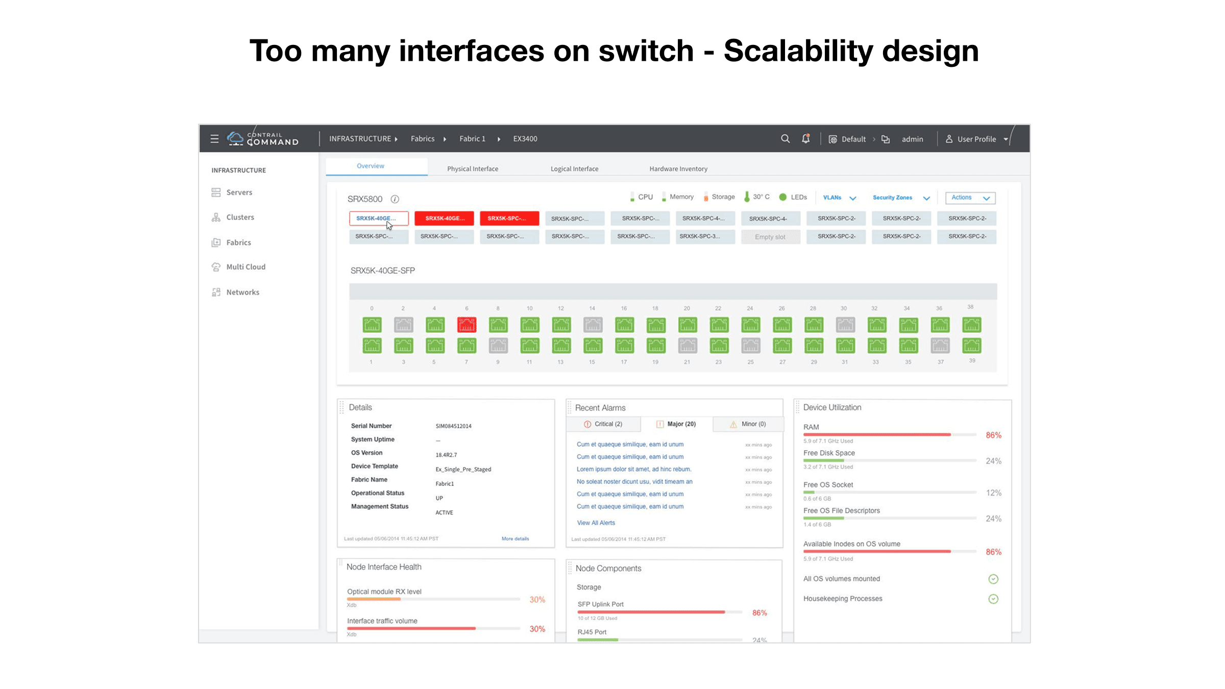
The same dashboard had to accommodate switches with few interfaces as well as those with hundreds. Creating a layout that scaled fluidly without overwhelming the user was a key design and engineering hurdle.Inconsistencies from Plugin Dependencies
Some extended features were implemented using external plugins, which introduced inconsistencies in data display. Working closely with developers, we documented these issues and created JIRA tickets to address them in future releases.
Key Learnings
Visual Language Can Reduce Cognitive Load
By shifting from dense lists to visual KPIs with motion and color cues, users could identify problems significantly faster. This affirmed my belief in the power of visual design as a tool for operational efficiency.Design Validation Requires Both Qualitative and Quantitative Insights
While usability tests gave direct feedback, benchmarking task completion time helped quantify UX impact. This dual approach was critical to getting stakeholder buy-in and proving design ROI.Hybrid Design Models Can Ease Transition
Completely removing legacy views could have alienated users. By retaining and improving them while introducing new visual models, we struck a balance between innovation and continuity.
Copyright ©️ 2025 ; Designed by Kasturi Paranjpe